
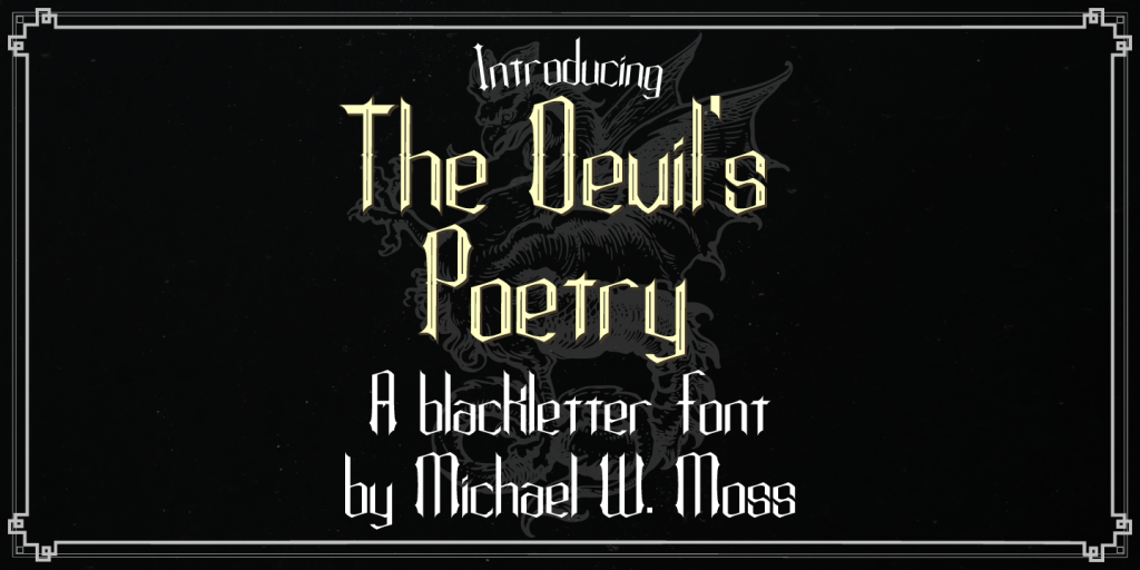
Style: Blackletter Gothic
License: MyFonts License
Purchase Link: MyFonts
About:
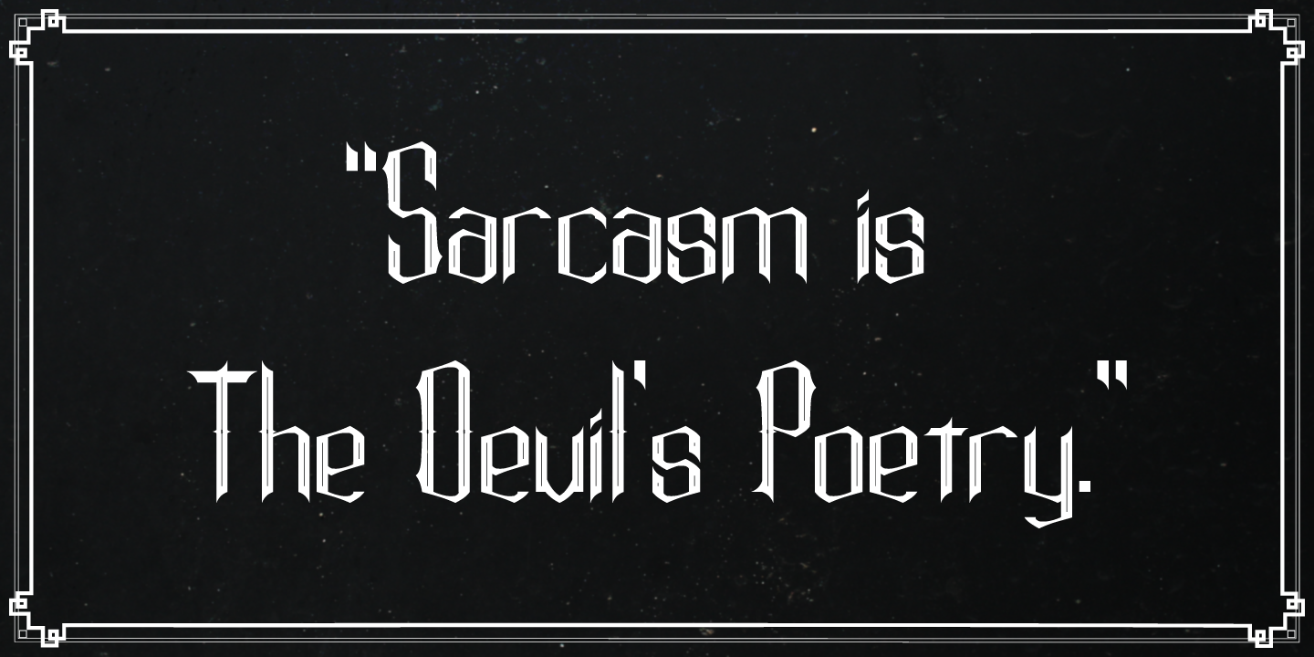
The Devil’s Poetry is my first commercial font. The initial idea behind it was a vintage-style typeface with tall vertical lines for the capital letters. The name comes from the phrase, “Sarcasm is the devil’s poetry.” The lowercase letters feature a pleasing hexagonal visual cadence while the capital letters stand tall and modestly ornate.
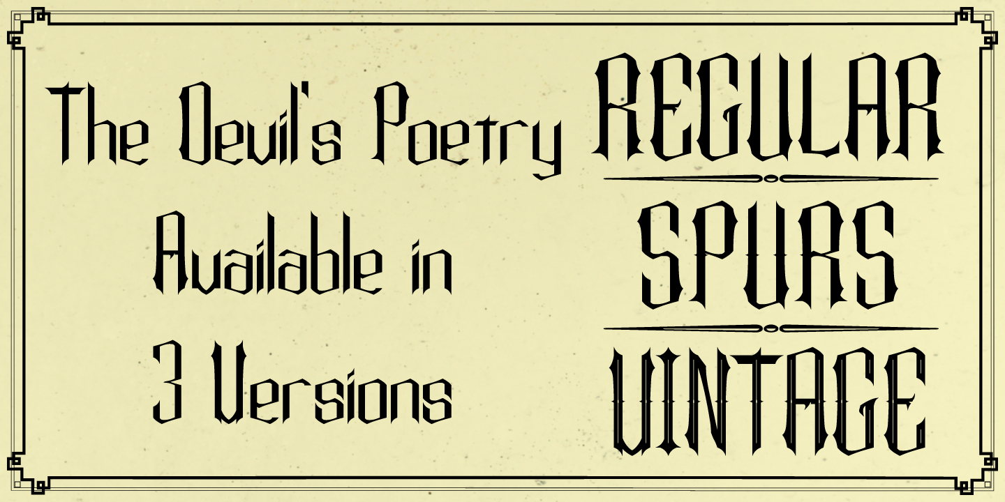
The Devil’s Poetry is available in three styles and features a Unicode Latin Extended-A character set.
After releasing the typeface, I wrote a poem to better articulate the mood and meaning behind the name:
Shield away the ears of the young
and clutch ye your rosary
upon the vulgar utterances of my tongue
for my sarcasm is the devil’s poetry.
Examples:


Uses:
The Devil’s Poetry font was used for the title and track listing on the AncolagE dark ambient album Daemones.